This project envisions itself as a piece of visual art, a poster at home for her dedicated fan base, the Yunationals! It's a tribute to all of you out there.


I want to highlight an amazing artist who holds a special place in my heart: Yuna, the talented Malaysian singer-songwriter currently based in LA with a global fanbase. Her music speaks to me deeply, and I'm always inspired by her relatable lyrics and the emotions they evoke.
Yuna's latest album, Y5, which was released last year, is truly something special. It's her first independently produced album, giving her complete control over the song selection and arrangement. What's even more interesting is that she released it in five EPs throughout the year. This unique approach kept me engaged and excited throughout 2022, eagerly anticipating each new release. And to top it off, Yuna also created visual accompaniments for some of the songs, adding another layer of depth to the experience.
So, I decided to create an infographic as a "love letter" to Yuna, expressing my gratitude for bringing Y5 to life and sharing her incredible talent with the world.
Here is the early stage of making this data visualization:

I wanted to create an interactive art piece on Tableau initially, but my limited time and mathematical skills to visualize it the way I envisioned (as shown in my sketch later) led me to shift from an interactive and dynamic data visualization to a static infographic.
The image below illustrates how I collected data and the platforms I utilized, highlighting why Y5 is, in my humble opinion, her best album so far.

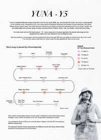
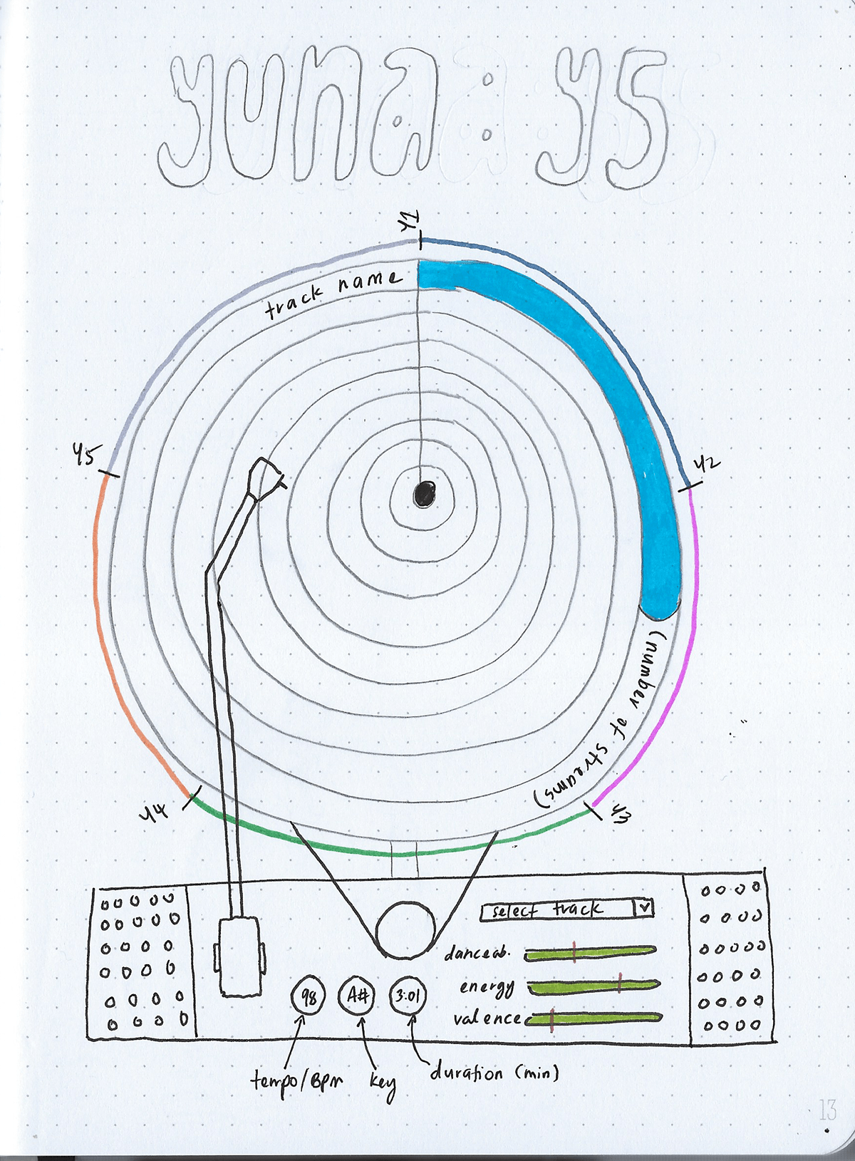
In the initial stages, I brainstormed various layouts for depicting the progression of her four Extended Plays leading to the completion of Y5.
The concept here is to visually represent her journey, beginning with the release of the first EP, Y1, on March 1 and culminating with Y5 on November 11.


For the color palette, I extracted hues from her album art using the Adobe Color tool:


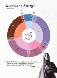
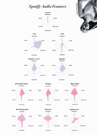
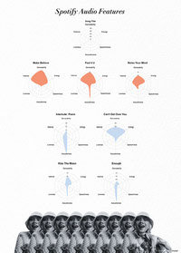
I eventually settled on a vinyl-shaped design that showcases all the tracks from Y5. The primary vinyl image displays the Spotify stream counts, while below it, I've included audio features obtained through R Studio.
From the sketch, I then created the wireframe on Illustrator:

Originally intended for Tableau, I even created a Tableau dashboard for the sketch.
Please note, it's quite basic and skeletal.
Please note, it's quite basic and skeletal.
Best to view this dashboard on a desktop browser.
However, I wasn't satisfied with the Tableau version as it didn't meet the aesthetics I was aiming for. This is where RAWGraphs came into play.
This completely shifted the project's direction from Information Visualization to Visual Art. RAWGraphs allowed me to easily create sunburst and radar charts, downloadable in SVG format.
After several permutations and trials, I arrived at the final Y-5 infographic that you see now.


Feel free to download the high-resolution version here and print it wherever you are.